Background
wayss does invaluable work in family violence and homelessness, yet their website struggled to reflect their impact nor was it easy to find information. The structure was complex, there was overwhelming content, and outdated visuals that didn’t align with their purpose or audience’s needs.
Recognising the importance of a website that served their purpose, it was agreed to look into the what the website could look like.
What was clear was the need to create an online platform that showcased wayss impact, engaged the needs of clients and other audiences and was simple to navigate.
This updated digital presence now aids them to encourage partnership and to connect more effectively with the people and communities they support.
Approach
The website rebuild was a cocreation between clients wayss serve and the team. Starting with focus groups of individuals with lived experience, their insights were instrumental in shaping the redesign as was the wayss team where ‘must haves’ were noted and streamlining of information was prioritised.
Findings
Here’s what we found:
- Clients primarily visit the site to quickly access contact information and essential resources. Women experiencing family violence, however, told us they didn’t use the website to seek information because it wasn’t safe for them to do so. Instead, they relied on other sources to find support. This insight completely changed how we thought about accessibility. Rather than focusing on providing extensive resources on the site, we needed to make sure the most direct way to get help was front and centre. For all clients, the contacts page was the most important destination.
- Stakeholders such as donors, industry professionals, and other interested parties turned to the website for clear, detailed, and well-organised information about the organisation.
- Government entities needed to ensure wayss was meeting its compliance requirements and that policies and other documentation was clearly available to all stakeholders.
Recognising these distinct needs enabled us to refine our objectives and set more effective goals.
We prioritised accessibility for clients, ensuring a clear, direct pathway to support and resources with minimal barriers. For stakeholders, we created an intuitive, seamless experience to access critical organisational details. We established a dedicated area for all policies with links to the appropriate services.
By grounding the redesign in lived experience and real user behaviour, we built a website that serves its audience with clarity and purpose.
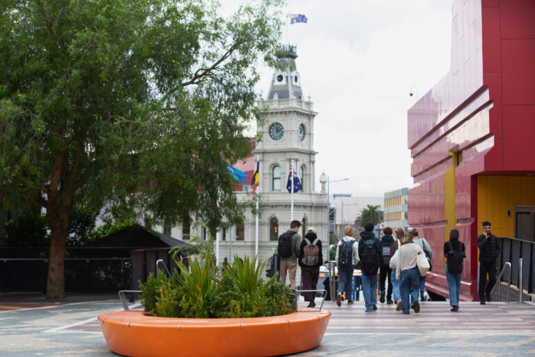
We carefully selected a warm, welcoming colour palette to create a sense of safety and support, and we furnished the website with photos taken in the local area, avoiding stock imagery, to ensure authenticity and a genuine connection to the community wayss serves.
Impact
The new wayss website is more than just visually appealing. It’s a hardworking platform that establishes the organisation as a trusted leader in its field. Striking a balance between professionalism and empathy, the site features a vibrant colour palette and custom imagery that bring to life the human stories at the core of their mission. It reinforces their community-driven focus while showcasing their commitment to making a difference.
This project demonstrates how thoughtful, user-centred design rooted in collaboration can drive meaningful change. A great website isn’t just a functional tool, it’s a reflection of an organisation’s values, expertise, and heart.
wayss, a not-for-profit government organisation, is dedicated to listening to, guiding, and standing up for people in the southeast region who face the challenges of family violence or homelessness. Providing personalised support, safe places to stay, and addressing the root causes of disadvantage, wayss is a vital lifeline for those in need.


